Posterial.com Gives My Photographs a Second Life as Poster Art
Posterial.com is where I am taking some of my photographs after the usual editing is finished. A street scene can become a field of strong color, a ruined arch can turn into a few decisive shapes, and a crowded piece of pavement can start to look like the main subject. The site brings these experiments together as poster art, with articles that look closely at each image and consider how it might work on a wall. It is a good place to browse if you enjoy photography that keeps changing after the shutter has closed.
The dancing scene here gives a fairly clear idea of the direction. People have gathered outside a row of shops, moving in loose groups across a patterned stone pavement. The original photograph catches an ordinary social moment, with overlapping figures and plenty happening around the edges. In the poster version, deep navy shadows and golden walls hold the scene together. Pale blue trousers, turquoise fabric and cream shirts pull individual dancers forward. I like that the transformation leaves the gathering a little untidy. The people still seem occupied with each other.
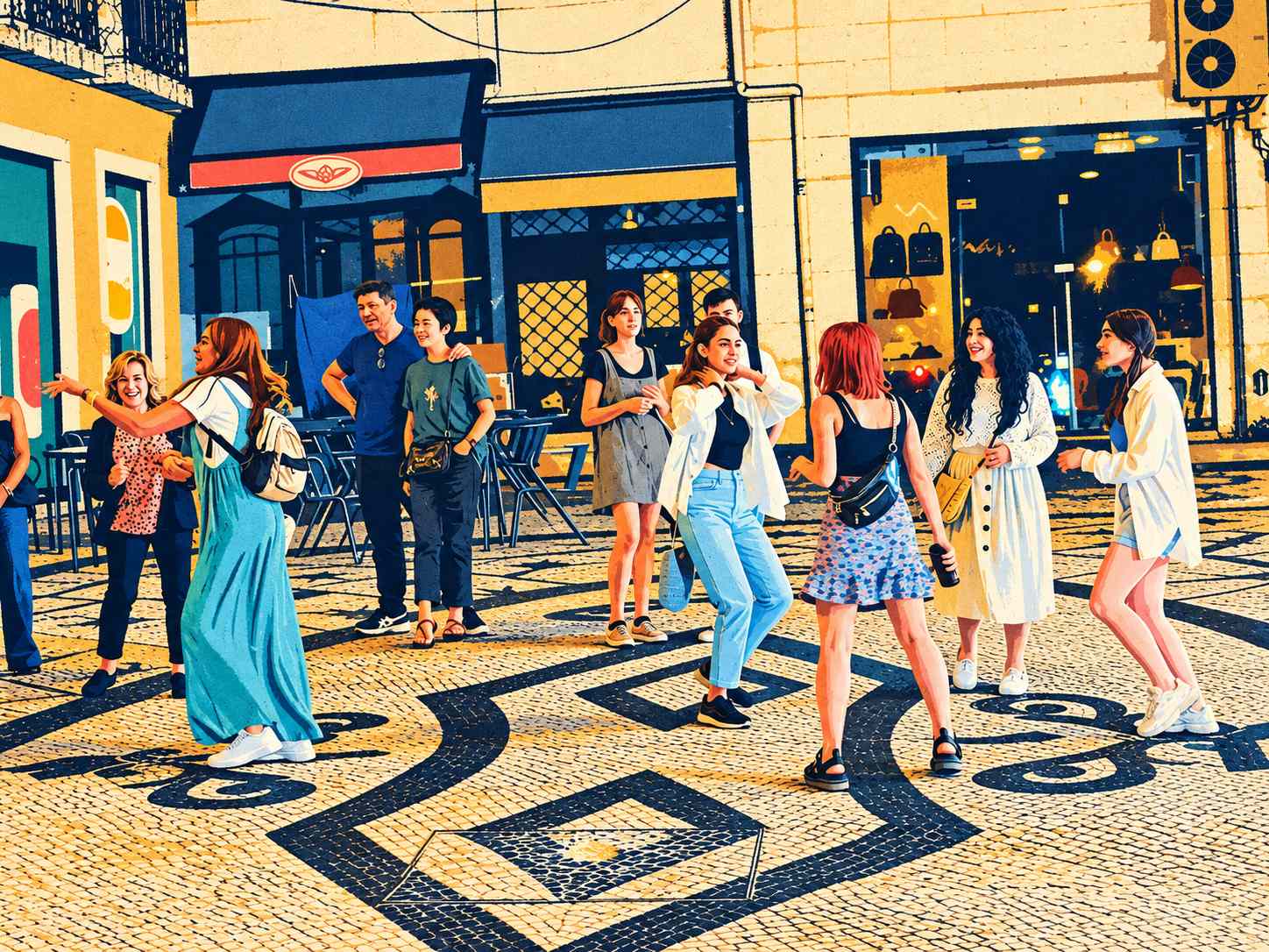
Image hosted by Pxef.com.
Look at the ground first. Dark curves run up from the foreground, bend around circles and meet angular borders in the mosaic. They give the image a rhythm before you have picked out a single dancer. At the left, a woman in long turquoise trousers reaches outward, her pale backpack making a bright shape against the figures behind her. Near the middle, another dancer lifts her hands toward her shoulders, her open shirt catching the light. A red-haired woman faces away in a blue patterned skirt, while two women at the right turn toward the group. The gold shopfronts form a fairly steady grid behind all those moving bodies. Small highlights in the dark window keep the background alive.
The Posterial article about this street dancing poster follows those relationships through the picture. That is the part of the site I want to develop: give the image enough attention that the reader can see why it works. A color choice has consequences. Make the pavement too quiet and the scene loses much of its movement; make every face and shop detail equally sharp and the larger composition gets buried. Sometimes the interesting decision is simply what to leave alone.
There is already room to wander beyond this scene. Brussels in vintage travel colors takes an architectural view toward the atmosphere of an illustrated travel print. Summer Among the Ruins holds on to the weight of golden masonry and the small presence of visitors above a stone arch. The site also explores original botanical and abstract designs, with named collections connecting related work. The articles consider placement and framing alongside the artwork itself, so browsing can be useful even when your immediate question is what to put above a desk or beside a reading chair.
For me, Posterial is also a reason to look through photographs again. The images that suggest a poster are not always the ones I would choose for a conventional photo gallery. A heavy shadow, an awkward patch of color or an unusually busy foreground can become useful once the picture is reduced to broader shapes. This dance scene has all that pavement taking up space, and the poster makes a virtue of it. There is something satisfying about finding another picture inside a familiar file.
Have a look around Posterial.com, starting with whichever image catches your eye. The street dancers are a good introduction to its bolder side: warm stone, blue clothes, dark curves and a moment that feels as though it could keep moving. I will keep building from there.